
The CLUB Hotel - Gateway to the Goldfields
Client: The CLUB Hotel
Project: Brand Identity, Web Design, Digital Marketing & Social Management
Sector: Hospitality
The Objective
To create a brand identity to support the reopening of the iconic “The Club Hotel” in the gold mining town of Southern Cross, WA.
Built in 1888, soon after the discovery of gold in the region by Thomas Riseley, prominent businessmen, including Alex Forrest (brother of the then Premier Sir John Forrest), erected a fairly primitive hotel. In 1889 it was replaced with a more permanent structure and by the early 1900’s was the departure point for Cobb & Co coaches, ferrying travellers to the historic mining towns Coolgardie and Kalgoorlie as “gold fever” took hold. The CLUB Hotel is the original meeting point of all development and progress of this important pioneering town.
Discovery of gold at neighbouring Bullfinch Southern Cross in 1910, transformed the Club Hotel to her present day, two-storey structure. Despite restorations in the late 1990’s her popularity faded with the town until 2022, when renewed historical interest in the town and its essential role in the development of the Goldfields throughout the Yilgarn region was recognised.
After an extensive major renovation, the iconic family friendly CLUB hotel is reopening to serve the growing local Southern Cross mining and wheatbelt communities. Offering luxury accommodation and an artisan craft brewery, it aims to become the must-see stopover attraction or destination for travellers and tourists heading east and west along the historical pipeline highway.
The new brand identity needed to be one that embodies and stays true to the CLUB Hotel’s rich pioneering history; but also one that shows progress and positions the CLUB not just a hotel; it’s the destination.
The Solution
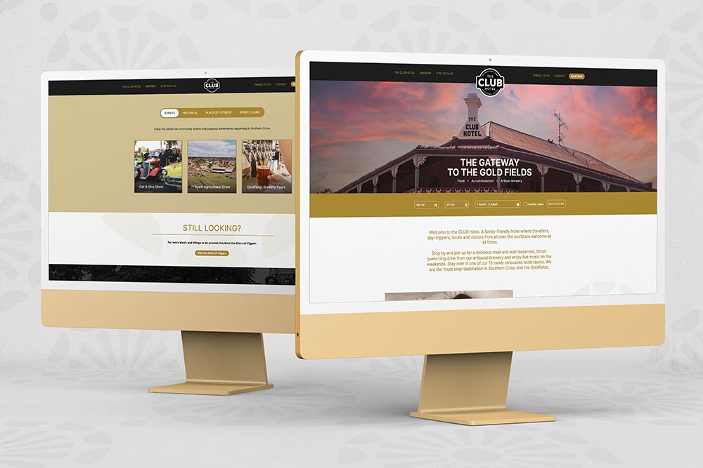
Being the original hotel in Southern Cross from its inception in 1888, this is the core brand and most powerful position to separate it from the other hotels in the town. Its unique geographical location on the border of the prosperous wheatbelt and goldfields, set up the tagline “The Gateway to the Goldfields” making it very clear to travellers and locals what the hotel is about.
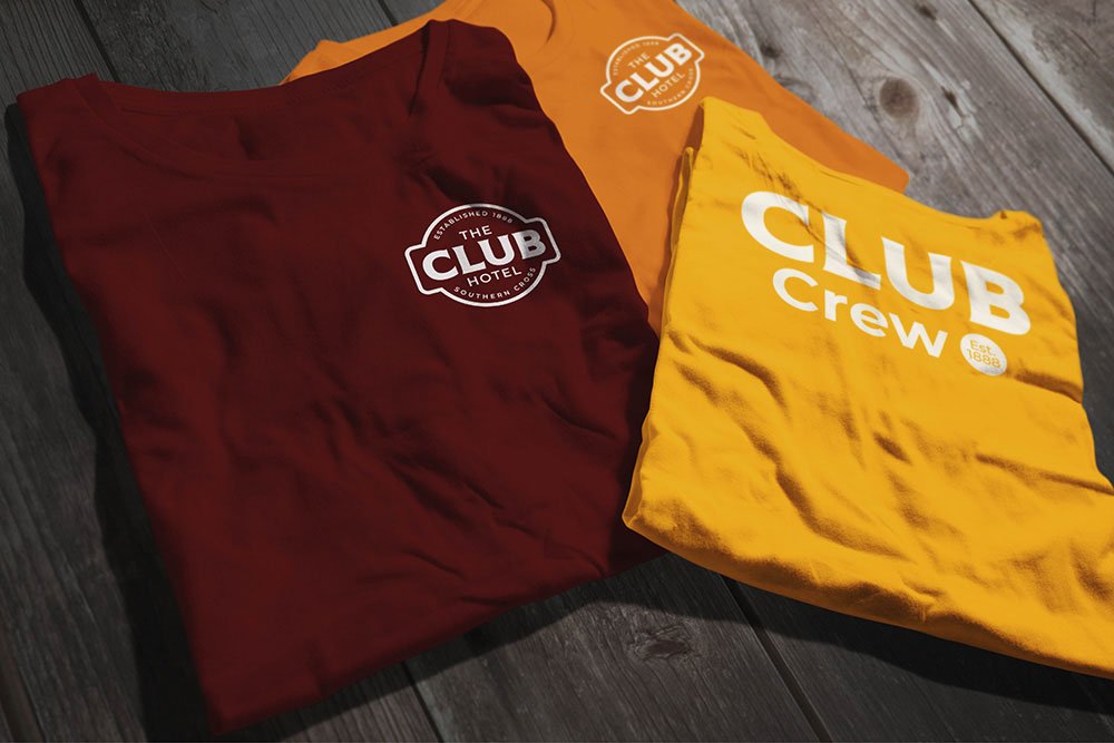
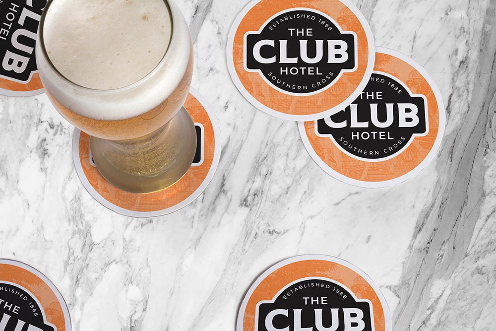
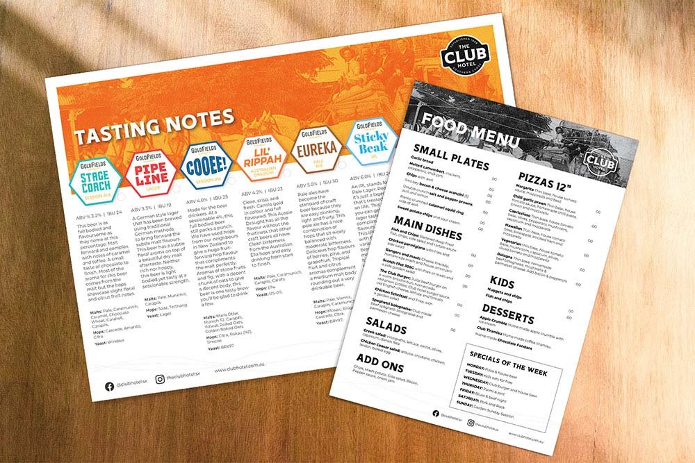
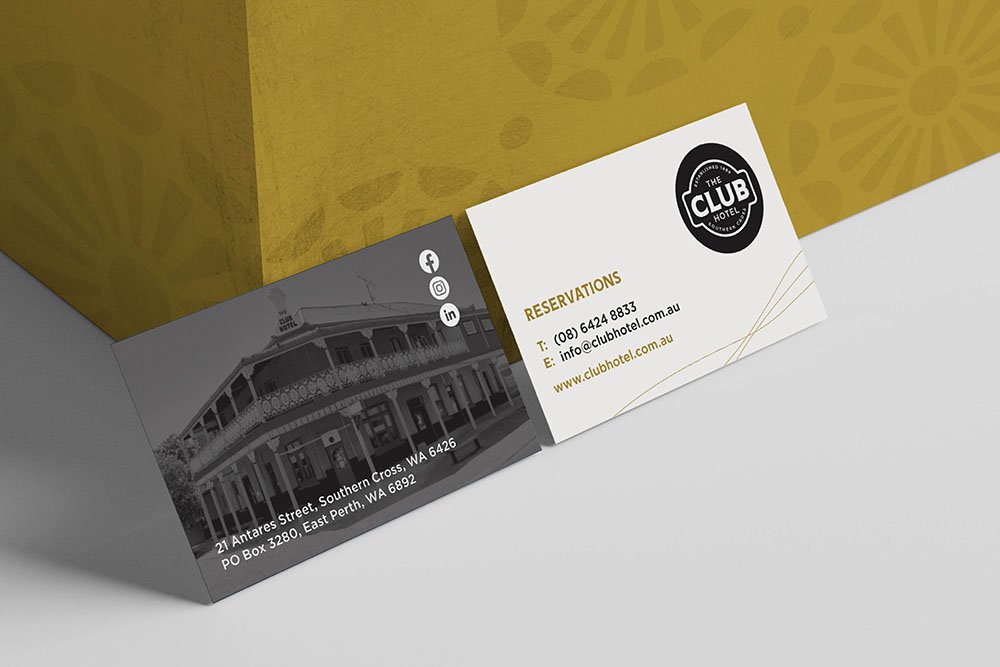
The brand language of gold and black reflects the premium luxury service offering with origins taken from the playing card “club” symbol of the previous logomark, the gold of the wheatbelt and gold mining history. The rich heritage is reflected in the Cobb & Co prints and historical prints that capture the CLUB hotel through the ages.
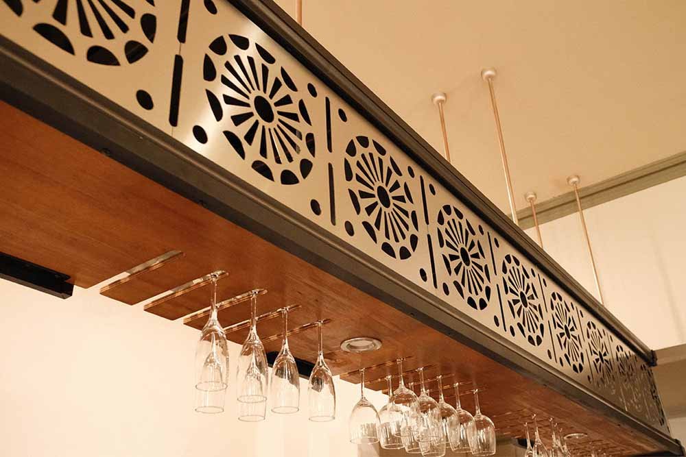
Key floral patterns taken from the original balustrade have been redrawn, simplified and redistributed throughout the hotel appearing in the new aluminium canopy above the main bar and the privacy screens between the deluxe rooms.
The website whilst simple to navigate is packed full of ripe SEO content to bring future travellers looking to explore the region will very quickly bring awareness of the hotel and its offerings; including booking overnight accommodation, the Goldfields Brewery and local events.
“Really great work Marcus and team 👏👏👏”
Dovetail Brand Engagement are a dynamic branding agency based in Melbourne and Perth, who are also experts in Human Resources. They combine and align the power of both “brand and culture” to transform Australian & International businesses to the next level. If you would like to find out more about how we could “redefine your brand” please click here.